Overview
In order to understand a document, everyone depends on understanding its structure. For example, consider the current web page. It includes a banner, multiple navigation menus, and the main content which you are reading currently. The main content is organized into sections marked by headings and subheadings, and the content within those sections is comprised mostly of paragraphs and lists. Sighted users understand all these relationships at a glance, based largely on visual characters such as the size and position of content relative to other surrounding content.
Screen reader users need to understand this structure just like everyone else. Therefore, they are dependent on content authors clearly identifying the headings, paragraphs, lists, tables, banners, menus, and other features as exactly what they are. In the world of web design this is called semantics, building a page using web elements that define the role of the object. For example, when adding a top-level heading to a web page, use the built-in Heading 1 feature that your authoring software provides. If you just make the text big and bold, it may look like a heading but it isn't really a heading.
The remainder of this page describes a few important steps for ensuring your documents have good structure that is accessible to assistive technology users.
Headings
Headings provide a way for site visitors to quickly see how a page is organized, but did you know they can also provide the same benefit to non-sighted users? A properly implemented heading structure serves two purposes for these users:
- They provide an outline of the page. This allows users to understand how the page is structured and how the sections relate to one another.
- They provide targets so users can jump from heading to heading with a single keystroke (e.g., the letter “H” in some screen readers).
According to current web standards, as suggested by the World Wide Web Consortium, web pages should follow a hierarchical heading structure, without skipping levels. That is, each heading should not be presented without its parent heading. So you shouldn’t have an h3 heading without an h2 heading or an h2 heading without an h1 heading. This allows assistive technology users to skim the page by tabbing through headings in a logical manner to get to the information they are looking for without having to wade through the page's entire text from top to bottom.
When headings appear out of order, it can be disorienting for the person who cannot see your page. It’s like finding the appendices in the middle of a document and then discovering the table of contents has been placed after the glossary.
It is never a good idea to use headings for formatting purposes. It is always better to use headings for their semantic, intended purpose and use CSS for formatting text instead.
How to Add Headings Using HTML
The following are best practices for using HTML headings:
- Use
<h1> for the main heading of the page. For most pages, there will be only one <h1>. NOTE: ODE will use the <H1> one time in pages and documents... for the title
- Use
<h2> for subheadings beneath the main heading.
- Use additional levels of headings (
<h3> through <h6>) as needed if there are additional levels of sub-headings within your web page content.
- Ensure headings form an outline of your page content; avoid skipping heading levels.
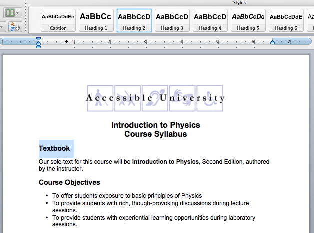
How to Add Headings in Microsoft Word
In Microsoft Word, add headings using the built-in heading styles (Heading 1, Heading 2, etc.) available in the Ribbon. To change the appearance of any of these heading styles, simplify right click on the style button and select “Modify”.
See Also: headings section in our About Word and Accessibility training series
Common Heading Mistakes
Some people find it easier to learn from their mistakes, so we are listing some we have seen.
1. Looks Like a Heading, but Isn't
If you style a title that introduces a paragraph, your intention was to make it stand out easily for sighted viewers... which helps them to quickly compare the titles and jump to the one they want. However headers provide non-sighted viewers the ability to compare and jump to those areas - via their screen readers. Consequently choose the header over the styled solution to provide the same experience to both sighted and non-sighted visitors.
Good Heading Example
<h5>My Heading</h5>
<p>Some details go here.</p>
Bad Heading Example, Don't Do This
<span style=”font-size:18px; font-weight:bold;”>My Heading</span>
<p>Some details go here.</p>
2. Headings Out of Order
Screen readers count on your headers to be grouped and in an understandable order. DO NOT SKIP HEADER SEQUENCES.
Good Sequence Example
<h2></h2> <h3></h3> <h3></h3> <h2></h2>
Bad Sequence Example, Don't Do This
<h2></h2> <h4></h4> <h4></h4> <h2></h2>
3. Headings that Should be a List
Scenario: you have 5 categories that you will turn into links. You are not displaying text below them.
Bad Example
  <h6><a>Category Blue</a></h6>
  <h6><a>Category White</a></h6>
  <h6><a>Category Red</a></h6>
  <h6><a>Category Green</a></h6>
  <h6><a>Category Black</a></h6>
Headings should indicate the start of important sections of content. If there is no content below them, they should be a list instead.
Good Example 1
<ul>
  <li><a>Category Blue</a></li>
  <li><a>Category White</a></li>
  <li><a>Category Red</a></li>
  <li><a>Category Green</a></li>
  <li><a>Category Black</a></li>
</ul>
Good Example 2
 <div class="btn-group">
   <a class="btn btn-primary">Category Blue</a>
   <a class="btn btn-primary">Category White</a>
   <a class="btn btn-primary">Category Red</a>
   <a class="btn btn-primary">Category Green</a>
   <a class="btn btn-primary">Category Black</a>
 </div>
4. Empty Headings
NEVER leave a header tag empty, or with spaces only
Bad Example 1
<h6></h6>

Bad Example 2
<h6>    </h6>
Lists
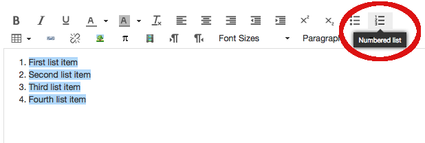
When creating content, it is important to recognize when your content is a list of items. For example, university web pages often include lists of links, events, staff members, degree programs, and much more. If lists are created as lists, screen readers can inform their users that they have landed on a list and can provide additional information such as the number of items in the list. This is extremely helpful information for users when they’re deciding whether to read on.
All document authoring environments include features that enable you to add bulleted lists or numbered lists, typically from a toolbar.
See Also: Lists section in our About Word and Accessibility training series
Tables (AWG / Developers)
Tables should be used only for presenting rows and columns of data, not for organizing the layout of the page. When creating a data table, understand that sighted users can easily scan and understand the table by looking at a given data cell along with its row and column headers, and comparing that with other data cells. People who are unable to see the table do not have access to all the visual cues that make this possible. Therefore, they depend on the table author to have provided markup that explicitly defines the roles and relationships of all the parts of the table. For example, all column headers must be identified as column headers and row headers must be identified as row headers.
Table Examples
See Also: Tables section in our About Word and Accessibility training series
Accessible Rich Internet Applications (ARIA) Landmark Roles - (Developers)
ARIA is a W3C specification that provides a means by which web developers can define the roles, states, and properties of user interface components so this information is exposed to assistive technologies.
One of the easiest ARIA features to implement, and one that provides significant immediate benefits to screen reader users, is landmark roles. Each of the eight roles represents a block of content that occurs commonly on web pages. They are used by simply adding a relevant role attribute to an appropriate container within the HTML mark-up. Once added, screen reader users can quickly jump to that section of the page. The eight roles are:
- role=”banner”
- role=”navigation” (e.g., a menu)
- role=”main” (the main content of the page)
- role=”complementary” (e.g., a sidebar)
- role=”contentinfo” (meta data about the page, usually the footer)
- role=”search”
- role=”form”
- role=”application” (a web application with its own keyboard interface)
If a role is used more than once on a page, the aria-label attribute should also be used in order to distinguish between the two regions. For example, a web page might have two navigation regions, one with aria-label="Main Menu" and the other with aria-label="Audience Menu".
Caution: Be Careful Using role=”application”
When role="application" is used, there is an expectation that the application has its own model for navigating and operating all controls by keyboard, and help text is easily available so users can learn the keystrokes. When assistive technologies encounter content that's marked up with role=”application”, they stop listening for users' keystrokes and hand off all functionality to the application. This can be problematic as it defies users' expectations. Keys that normally perform certain functions when using their assistive technology suddenly stop providing that functionality.
Therefore you should use role="application" only when an application has been carefully developed with accessibility in mind, and steps have been taken to inform users of what to expect.
See more on our ARIA page.
Most forms include form fields accompanied by labels or prompts. In order to figure out which labels accompany which fields, sighted users rely on visual cues such as relative position and proximity. For users who are unable to see the form, the relationships between labels and fields must be explicitly made within the code. For details about how to do this, see our page dedicated to Accessible Forms.
Most Details from this page were gleaned from the University of Washington's Accessible Technology section.